CSS Coding Course
CSS 101
Part 9b. Mobile Friendliness

In this part, we will learn about creating web pages that are mobile-friendly, so that your code looks just as good on your grandmother's old phone as on your techie uncle's huge 4K monitor. We will also address other device-friendly tweaks that your code might need if you suspect that your target audience might try to send your web pages to their 2D printer. But we will warn you ahead of time that this might not be an easy task.
Nevertheless, we want to give you as many of the tools you will need as possible to help you through this process. To be perfectly honest, one of the biggest pains in web development is trying to make an old website mobile-friendly as an afterthought. However for new projects, we strongly recommend trying to think about mobile-reponsiveness from the very start. And the reason we say that is because it is much easier to convert a web page that looks good on a phone to a web page that looks just fine on a bigger screen. Two of the tools we use that will help you the most here are Google Chrome's Dev Tools and Media Queries. These are both huge subjects, so without further delay, let's dive right in.
Mobile Responsiveness
This can be a huge subject to discuss to be sure. However, we have some tips that will prevent this from becoming a daunting and all-consuming task. You have probably noticed that mobile-responsiveness is somewhat built into all of the CSS projects you've done here. Of course one can spend an exorbitant amount of time writing media queries while attempting to make each website pixel perfect. But for the most part, that can be a huge waste of time. In general, mobile-responsiveness should always be a primary consideration rather than a secondary thought. And to reach that mobile device-friendly goal, we offer this list of guidelines to follow when creating web page layouts.
- As previously stated, always consider mobile-responsiveness as one of your primary design goals from the very beginning, instead of an afterthought to be dealt with later. Constantly test your web layout design by reducing the width of your web browser screen to view how all of the elements on your webpage appear on narrow screens, on wide screens, and on all other screen sizes in-between. If you do it right, the number of media queries you have to write later will be greatly reduced.
- Take advantage of flexbox as a layout tool as much as possible. You can always nest some divs inside of other divs, so let flexbox calculate the space-between required by all of the elements in your page layout. Remember that you can use flex-direction: column; when appropriate, rather than always having to use the default flex-direction of row. And remember to use flex-wrap: wrap; to deal with your many different possible page widths dynamically.
- The width of your document body should should never exceed 100%, regardless of the screen size it is viewed on. For that reason alone, it is often better to assign the width of longer elements in % percentages rather than in px pixels or even rem rems. Never allow elements that are going to be wider than your smallest page widths to be assigned widths in pixels or rems. If you ever get a horizontal scrollbar at the bottom of your webpage, then figure out which elements are too long and are exceeding the width of the document body. Reducing the width of any element that exceeds the width of your document body on the smallest screens is one way to achieve 100% mobile-friendly page layouts.
- While the width of webpage is a constant concern, the height of a webpage generally is not. Setting a document body rule of min-height: 100vh; will make sure that it never is an issue. Remember that vertical scrollbars are the way we navigate through long web pages regardless our device's actual screen width. When working with a width, we usually use a % percentage, but when working with a height, it is preferable to use a vh viewport height.
-
Create some CSS reset rules that help establish mobile-friendly page layouts.
Margins, padding, and borders can sometimes betray you, so setting box-sizing:
border-box; for your document body will help to make sure that the size of some elements like divs
never grow beyond the sizes you intended for them. Also setting a wild card rule of
* { margin: 0; } will ensure that you are never betrayed by the default CSS margin rules of any element. And don't forget that we talked briefly in the last part about loading the reset.css file before loading your regular stylesheet. By doing that first, you can often streamline and optimize this process along the way.
Media Queries
When all else fails, we have to fall back onto our knowledge of how to write effective media queries. Although hated by some web developers, they are the essential tools that solve web layout problems for which there are no other solutions.
Media queries are so important that entire professional careers have been launched on the ability to write them. If you've ever tried to send a web page to your printer and found that it printed lots of pages with bad results, that would be the fault of web developers for not writing media queries to deal with how those web pages are interpreted by 2D printers, as well as by how they are displayed on devices with screens.
Printer-based media queries are a deep subject that we will sidestep for now. However, a basic knowledge of how to write media queries to make your web pages mobile device-friendly is definitely a subject that we will cover here.
And to be perfectly honest, the task of writing media queries was never something we enjoyed. In fact, we think that handing this task to your favorite AI chatbot might be your best and fastest solution. However, our next project was not mobile-responsive until we painstakingly wrote our own media queries to make it look good on almost any device. So let's look at that project now.
Exotic Island Adventures
This project is called Exotic Island Adventures, and you can click here to preview this project, and to get a better idea how it works. For now, let's look at all of the features this project offers us before we start diving into the code. Of course, the first thing you need to know is that this is a one-page website for a fake company. And all of the contact information is also fictitious as well. That street address and the telephone number used to belong to a Burger King in Honolulu, and that business went under. So as far as we can tell, the building stands there unoccupied and the phone number remains disconnected.
But let's take it from the top, shall we? If you open this project in a nice fullscreen mode like 1920 × 1080, you will notice that we have a navbar at the top of the page. This is not a "sticky" navbar, like some that we have seen in past projects. As you scroll downwards, this navbar disappears from the top of the page. Another thing you will notice is that hovering your mouse over each item on the navbar changes its color to gold and its text grows in size as well. Below the navbar, we have a carosel slideshow of 14 different tropical island scenes. This carousel slideshow uses the very same images that we used in our Parallax Scrolling project in our previous lessons. Another nice feature of this website is its ability to do smooth-scrolling. As you click on the other items on the navbar, the webpage scrolls smoothly to its destination section. You will also notice that there is little gold up-arrow in the lower-right corner of the web page. When you click on that arrow, you will smooth-scroll back to the top of the web page where the navbar exists. This eliminates the need for fixed and sticky navbars. Since this website is only a front-end, client-based website, the link to the contact form takes you to our Google Form, and that is often the best way for front-end developers to get information back from visitors to your website. Also, we used a little JavaScript to make the copyright message at the very bottom of the webpage. The year of that copyright message changes automatically at the stroke of midnight between New Year's Eve and New Years Day.
Now let's resize this website to a width that is as small as your web browser will allow. Notice how nicely everything you see resizes proportionately to stay in view on your screen. This is what media queries can do for you. But more importantly at this point, notice how the navbar disappears and is replaced by a hamburger menu. Now, when you click on the hamburger icon on the top right of the navbar, a dropdown menu with a transparent background appears below the hamburger, and each item on that menu works the same way as it did from the fullscreen navbar, except that it no longer grows in size with each hover. The last thing we'd like to mention before we get into the actual code is that seven of the icons used in this project were taken from the free icons library offered at no cost by Font Awesome. This subject was covered in great detail in CSS Part 8d.
Our primary focus will be on media queries, but some JavaScript code is also required to create the carousel slideshow, to create the copyright message, to position the up-arrow that returns viewer to the top of the web page, and to create the dropdown menu on smaller screen sizes. Yes, this might be the most challenging project you've look at so far, but you are nearing the end of the CSS Coding Course, so completing this project will help you greatly when you get into the JavaScript Coding Course.
Download the project source code here. At this point, we are done explaining how to unzip a ZIP file, where to store a project, and how to open a project in VS Code.
The HTML Document
The only thing of real interest in the document head of index.html is on line 8, which is a link to the Font Awesome icon library in this Cloudflare CDN. A CDN is a Content Delivery Network, which is a free file repository on the cloud that allows us to download content for our web pages. This project uses 7 free Font Awesome icons that it downloads from this CDN.
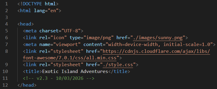
NavBar
At the top of the document body in the index.html file, we find the code for the navBar div on lines 16 through 37. On the left side of the NavBar is an image of the sun wearing sunglasses, and it has the unique id of logo. If you click on this image, it reloads this web page, which seems unnecessary considering all of the other navigation tools that are available.
On the right side of the NavBar is the actual navbar links for wider screens. You will notice that the unordered list <ul> tag with the unique id of nav begins on line 20 and ends on line 36. On wider screens, you will only see the list items <li> on lines 31 through 35. Notice that each one of these list items has two classes attached to them: a class of grow and link. The class of grow allows the size of this link to expand in size when we hover our mouse over it. And the hover itself causes the color of the text to turn to the color gold. The class named link appears to be mostly informational, but it does hide these navbar list items on smaller screens.
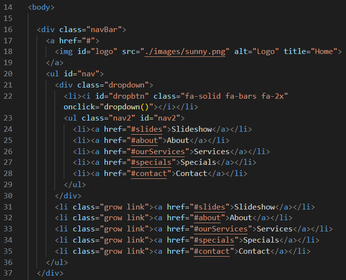
On lines 21 through 30 above, we have code for screens that are much narrower, or 650 pixels or less, in width. If you reduce the width of your browser screen while this project is open, you will see the result. All of the list items on lines 31 through 35 disappear, thanks to the link class. And at the same time, a hamburger icon will appear. That icon can be found on line 22. And when you click on that icon, then the dropdown menu on lines 23 through 29 appears in a column with a semi-transparent background. Notice that the unordered list <ul> tag on line 23 has a class name and a unique id that are both named nav2. That is because the list items <li> on lines 24 through 28 are pretty much the same ones that are now hidden on lines 31 through 35. And congratulations to you if this is the first time you've seen code for a hamburger dropdown menu. This is important code you should know in order to make your web pages more mobile-friendly.
Before we move on to the next section of HTML code, let's look at some CSS and JavaScript code to help us understand how this NavBar code actually works.
NavBar CSS
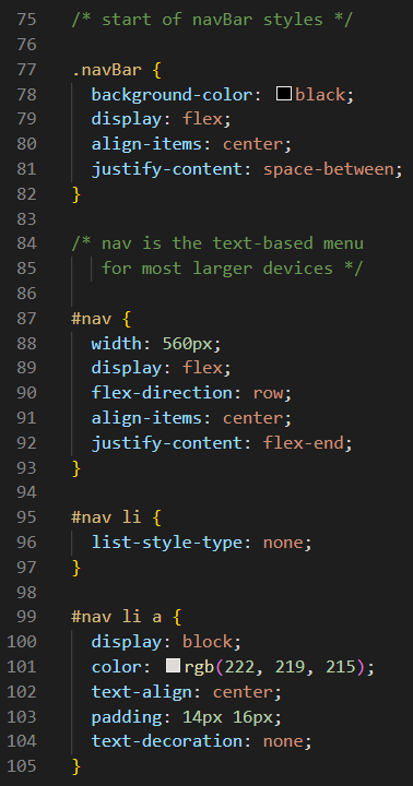
The NavBar CSS styles start on line 77 of the style.css file, and the parts that we are most interested in at this point end on line 170. We will display each relevant section below as four separate parts.
By now, the code on lines 77 through 82 should not require much explanation. However, starting on line 87, we begin to see the CSS style code for the #nav, which only appears on screens that are greater than 650 pixels in width. Line 90 is redundant because the default value for flex-direction is row. However, line 92 forces #nav to the right side (or end) of this .navBar horizontal menu. The rest of the code in this section is nothing new.
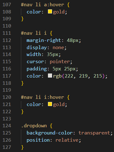
The code below on lines 107 through 109 is what turns the text gold when you hover over each list item. And that would also work for the hamburger icon on lines 120 through 122 if it was visible. But line 113 hides that icon, which will later be changed by a media query. In fact, everything on lines 111 through 127 is invisible on larger screens. Howver it is important to look at lines 125 and 126. The rules for the .dropdown class are invisible because they have a transparent background color. But it is important to notice that it is positioned relative to the other list items using the .nav2 class, which use absolute positioning. And we will look at those rules next.
In the section below, we see all of the rules for the .nav2 list items. Of course, line 133 changes with a media query when the screen size is 650 pixels or less in width. Line 139 is also important because z-index: 1; ensures that the dropdown menu is always in front of all of the other elements on the web page.
One last note before we move on, hover effects do not happen on mobile devices because there is no way to determine if your finger or stylus is hovering over an element on the screen. That means that lines 155 through 158 do not work on a phone or tablet. That also applies to lines 107 through 109, and lines 120 through 122, in the section above. And it also applies to lines 168 through 170 in the section below this one. In short, all other functionality works perfectly fine on all mobile devices except hover effects. So now, you know the reasons why.
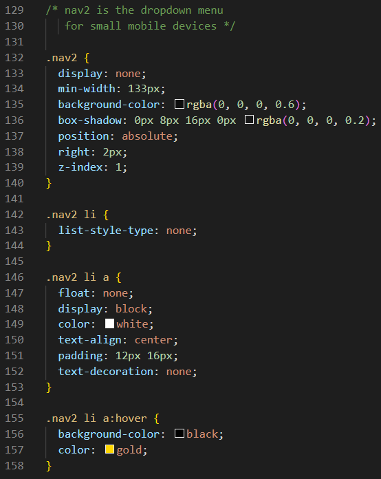
On wider screens that are not mobile devices, we use the grow class. That is why hovering over list items on the navbar makes them turn gold and grow. And the code for that is on lines 164 through 170. The show class on lines 160 through 162 is another matter entirely. We use JavaScript to add that class to display the dropdown menu created by the unordered list named #nav2 when the #dropbtn hamburger icon is clicked.
NavBar JavaScript
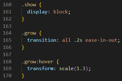
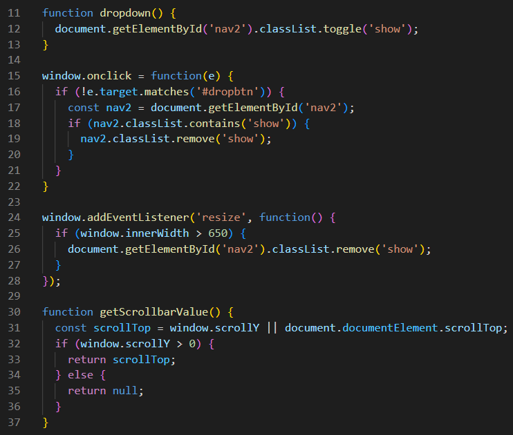
If you look at line 22 of the index.html file, you will see that clicking on the hamburger icon named #dropbtn toggles the #nav2 dropdown menu on and off. It does that by calling the dropdown function on lines 11 through 13 in the script.js file as shown below. And although the code on lines lines 15 through 22 might be difficult to understand, that onclick event removes the show class, and thus turns off the the #nav2 dropdown menu if you click anywhere else on the web page other than the hamburger icon.
So in summary, this NavBar may appear to be simple at first glance. But when you actually start looking at the code behind it, you see that it is not quite as simple as it looks.
Up-Arrow & Carousel Slideshow
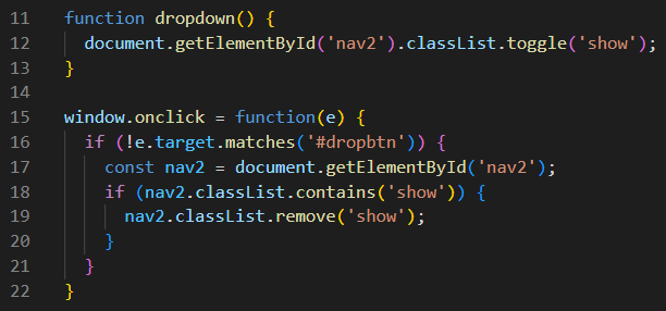
Now let's look at the next two divs in our index.html file. They are shown below. The code on lines 39 through 46 creates the content behind the up-arrow that appears in the lower right corner of the screen when you scroll this web page. And of course, clicking on this same up-arrow returns you back to the top of the web page before it disappears. And although it is completely separate from the NavBar, you should think of it as part of a larger web page navigation system that makes viewing this web page much more user-friendly.
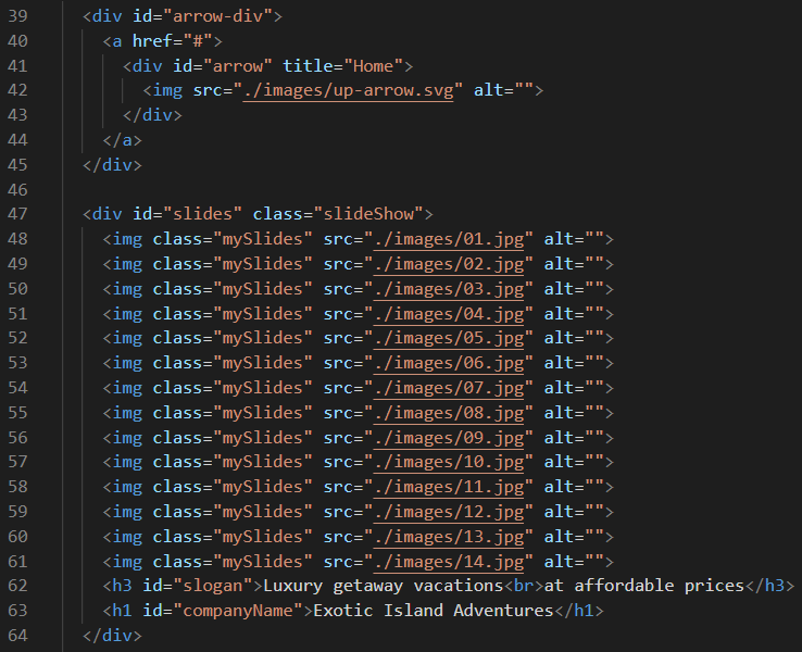
However, the Carousel Slideshow content is shown above on lines 47 through 64. This slideshow runs automatically, and otherwise provides no user interaction. But all of the HTML code you see above only provides static content. In other words, without CSS and JavaScript code, it can do nothing on its own.
Up-Arrow CSS Code
The CSS code shown below provides styling for the up-arrow. This item consists of two integral parts: the #arrow-div on lines 172 through 182; and the actual #arrow on lines 184 through 192. And on line 194, the comment tells us that this is where the navBar styles end, even though they are completely separate from the actual NavBar as previously stated.
On line 173, we define the #arrow-div as position: fixed; and then we assign it coordinates that are 10 pixels from the bottom, and 8 pixels from the right side, and that is where this up-arrow resides, regardless of how we scroll or web page up and down. On line 175, we give it z-index: 10; to make sure that it is always in front of other elements on this web page. Then, we give this div a width and height of 25 pixels, and by setting a border-radius to 50%, it shapes this div into a circle. We give this div a background color of semi-transparent black. And on line 181, we make it invisible. Of course, JavaScript has the ability to change the properties of the declarations on lines 180 and 181, as we will see later.
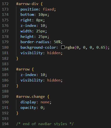
The #arrow code on lines 184 through 187 above follows the z-index and visibility rules of the #arrowDiv. And anytime there is a change to the #arrow, like when the web page scrolls back to the top, lines 189 through 192 make it invisible once again.
Up-Arrow JavaScript Code
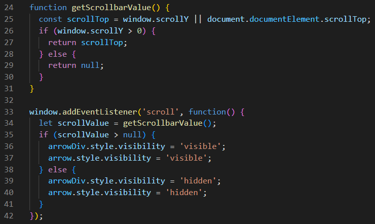
At there very top of our script.js file, we establish three global variables. On line 7 and 8, we simply tell JavaScript how to find the #arrowDiv and the #arrow elements by identifying each through its own unique id. On line 9, we are setting the slideIndex of our slideshow to 0, and we will see that used later.

All of the magic for the #arrowDiv and the #arrow elements happens in the code shown below. On line 33, we add an event listener that detects any scroll event in the window. And when a scroll event is detected, it runs the function that follows on lines 34 through 42. Line 34 calls the function on lines 24 through 31, which creates a variable named scrollTop. And the if-else statement on lines 26 through 30 returns a value of false if the web page is no longer located at the very top. On the other hand, it returns null back to line 34 if it remains at the top.
So now that a value is returned, another if-else statement on lines 35 through 41 evaluates the value returned to determine if the #arrowDiv and the #arrow elements should be invisible or not. And if this code doesn't make a lot of sense to you right now, don't become alarmed. All of this will make more sense when you take our JavaScript Coding Course.
Carousel Slideshow
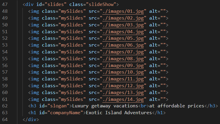
The code we see below on lines 47 through 64 of our index.html file is the content required for our Carousel Slideshow. It runs automatically when the web page loads, and requires no user interaction. But let's look at the code behind this div to better understand how this carousel slideshow works. And what is a carousel anyway? It is also known to many by the term merry-go-round. This is an amusement park ride that goes around in a circle, repeatedly returning to the place where it started. And that term seems to describe this slideshow well.
Let's explore some of the identifiers in the code below. On line 47, this div is given a unique id named slides, and a class named slideShow. This slideshow consists of 14 images on lines 48 through 61, each with a class name of mySlides. On line 62, we have an h3 element with the unique id of slogan. And on line 63, we have an h1 element with with the unique id of companyName. It probably goes without saying that our CSS and JavaScript code relies on these identifiers to make this slideshow operate properly.
Carousel Slideshow CSS Code
Lines 197 through 199 below defines our slideShow as position: relative; because our slogan and companyName are positioned absolutely but relative to our slideShow. Lines 201 through 205 ensures that the width of each one of mySlides remains at 100%, regardless of the width of the web browser window. This code also creates the gold border at the top and the bottom of our slideShow. CSS code for the slogan can be found on lines 207 through 218. As mentioned before, position: absolute; places our slogan exactly 5% below the top of the slideshow, but it is also perfectly centered on the page, thanks to the other code found here.
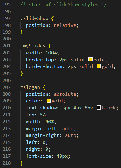
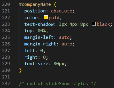
Something similar is happening with the CSS code for the companyName found on lines 220 through 230 below. As mentioned before, position: absolute; places our companyName exactly 80% below the top of the slideshow, but it is also perfectly centered on the page, thanks to the other code found here.
Carousel Slideshow JavaScript Code
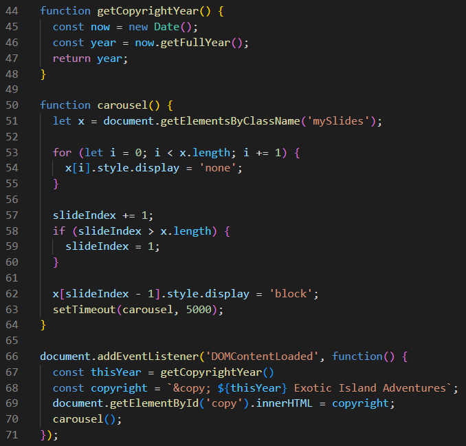
At this stage of the game we will only look at part of the script.js code shown below as it applies to our slideshow. We will visit this JavaScript code again when we get to the footer. For now, you only need to know that the code on lines 66 through 71 adds an event listener that waits until all of the DOM Content is fully loaded before executing the rest of this code. And it is line 70 that actually launches the Carousel Slideshow by calling the carousel function on lines 50 through 64.
Now don't forget that we set our slideIndex to 0 as one of the three global variables at the top of this script. And on line 51, we are creating an array named x that will contain all 14 of the mySlides images. And unless you know some JavaScript, we don't expect you to know what that means. But otherwise, just think of this array as a list of file names. The code on lines 53 through 55 makes all 14 images invisible for now. The code on lines 57 through 60 simply cycles through these 14 images, and then starts over again. In other words, when slideIndex become greater than 14, it is set back to 1 so that the slideshow can start all over again. Line 62 does the actual displaying of each slide. Line 63 creates a 5-second (or 5000-millisecond) timeout so that each image remains on the screen for exactly 5 seconds before it changes to the next image.
About
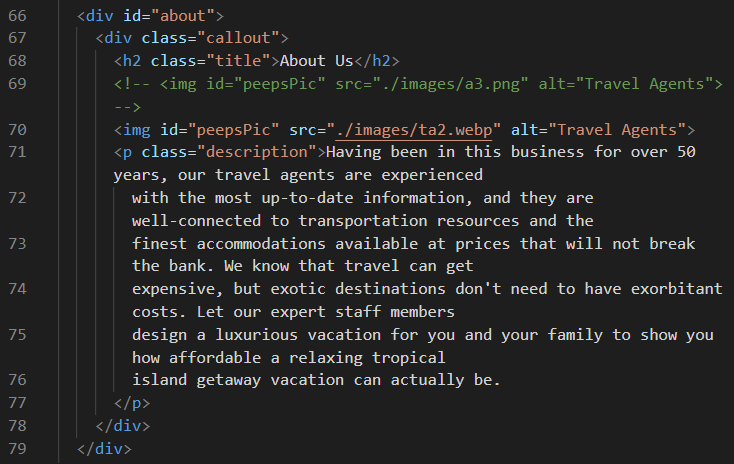
This section is actually pretty simple to understand. We have a title, and a peepsPic image of travel agents, followed by a paragraph named description that explains a little bit About us. Line 69 was commented out because that peepsPic image was actually just an image of a bunch of stuffed suits. And that's not the kind of people you want to deal with when discussing your vacation plans. Of course, you can always uncomment line 69, and comment out line 70 if you want to see that image. It's not better, but it is still here so you can see how web developers always have the option of changing their minds.
About CSS Code
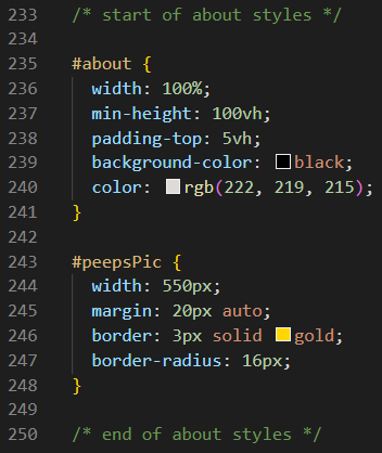
There really isn't much to explain about (pun intended) the code shown below. Lines 237 and 238 are using vh which stands for viewport height, which is usually preferable to using percentages to represent vertical sizing. And the peepsPic has an interesting border-radius on line 247. Otherwise, this section of code is rather uninteresting. And this section requires no JavaScript code, so let's move along to the Services section.
Services
The Services section of this web page begins on line 81 and ends on 117. It is a div with a unique id named ourServices and this div has a beautiful background image as defined by its CSS code, which we will see later. Before we talk about the six cards in this section, we wanted to mention that four of these sections have a callout and a title at the top of each section, and that includes the About, Services, Specials, and Contact sections. We will see the simple CSS for the callouts and titles later.
But let's focus on each of these six cards. And just in case you are unfamiliar with the term card, a card is usually a div that has a number of elements that similar to the same elements found in other cards that are all grouped together and nested inside of another div. Let's look at the first card in this section to see what we are talking about here.
Our container div that holds all six of these cards has the unique id of services, and it starts on line 85 and ends on line 116. And each of the cards is assigned a class named services. Remember that an id is supposed to be unique and used only once on our web page, but that a class does not need to be unique and can be used multiple times. That is why these two identifiers can use the same name.
Our first card can be found on lines 86 through 90 below. And each of these cards has three elements common to each card. These three elements are an icon, an h3, and a paragraph. In this first card, those elements exist on lines 87, 88, and 89, respectively.
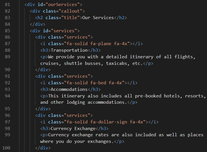
That means that each of these six cards have a service described by their individual icons and titles. In our case, the service that each card describes is Transportation, Accommodations, Currency Exchange, Restaurants, Guided Tours, and Other Activities. Now let's look at the CSS code we used to style all of these cards, and this entire section collectively.
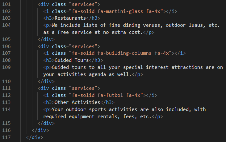
Services CSS
Lines 253 through 264 contain all the code used to style ourServices. On line 254, we make sure that this section has a minimum height of 100vh. on lines 255 and 256, we make sure that we add padding to the top and the bottom of this section equivalent to 10vh. On line 257, we assign an interesting shade of off-white to all the text. Lines 258 and 259 establish a gold border on the top and bottom of this section. And lines 261, 262, and 263 create this beautiful background image of a tropical waterfall. Lines 266 through 270 contains some general rules for our container div named #services.
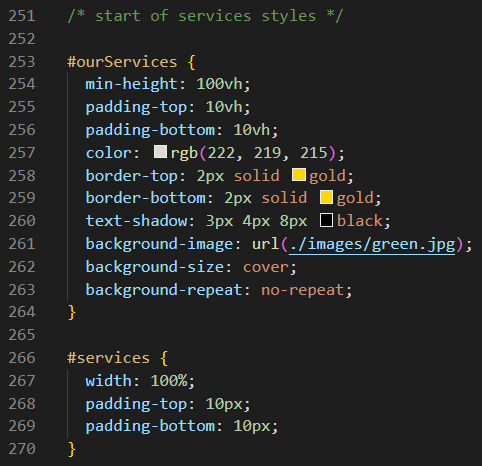
The code below is used to style each and every card which is assigned the class name of .services, and the code on lines 273 through 281 is the old-fashioned way of styling nested divs. This is essentially how we styled nested divs back before flexbox CSS rules were invented. On line 273, we assigned text-align: center; for all the obvious reasons. Then on lines 274 and 275, we establish our rules of card alignment with display: inline-block; and vertical-align: top;, and then by assigning a width: 29%; on line 276, it forms two rows of three cards with a little bit of space between each card, thanks in part to line 277, which provides 21 pixels of margin around each card. The code on lines 278 through 281 provides some general style code for each .service card div, that is unrelated to its alignment. The rest of the code in this section does not need further explanation. And the Services section uses no JavaScript code.
Specials
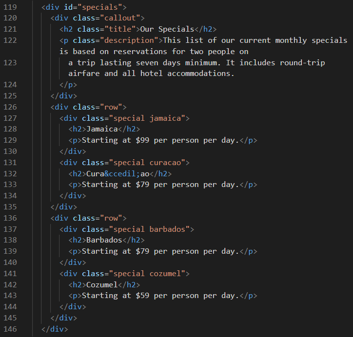
The Specials section is a lot like the Services section, except that it only has four cards instead of six. The entire section resides inside of a div with a unique id named specials. That div begins on line 119 and ends on line 146. One difference is that the callout div includes a title and a description. That code resides on lines 120 through 125. Another difference from Services is that we now have two row divs, and we have nested two special divs inside of each row. And once again, it is important to understand that the id named specials and class named special are two entirely different declarations.
Let's look at the first row on lines 126 through 135. Inside of this row, we have two cards: the Jamaica card and the Curaçau card. Notice that each one of these divs contains two elements: an h2 and a paragraph. Also note that each div has two classes: one named special and one named for each specific island. Now let's look at the CSS code behind this section.
Specials CSS
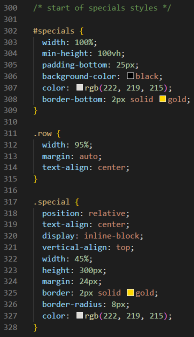
There is nothing really remarkable about the beginning CSS in this section. Notice that each row has a width of 95%, and that everything inside each row is centered. It gets more interesting with the special class on lines 317 to 328. On line 318, we define this div as position: relative; and we do that because each of the paragraphs have absolute positioning. The width of each card is 45% and that normally allows for only two cards in each row. The code on lines 319 through 324 is once again the old-fashioned way of doing CSS rules for card alignment. These days, you would use flexbox rules. The rest of this code is straightforward.
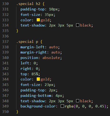
However, the code shown below on lines 337 through 350 is interesting in that we use absolute positioning to place each paragraph 85% of the way down from the top of each card. And we give it a semi-transparent black background color.
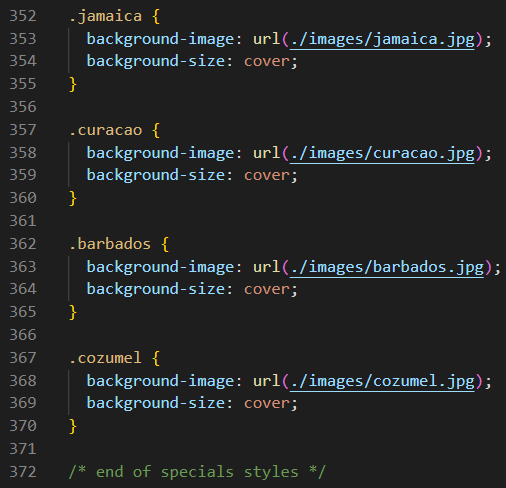
Of course, everything in this code shown below should look familiar. We are simply applying a background image of each specific island of interest to each of our four card divs. This section also uses no JavaScript.
Contact & Footer
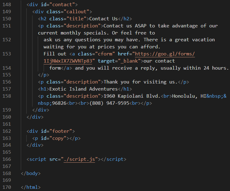
We have finally reached the very last bit of content code in our index.html file, as shown below. Most of this code is simple HTML code that you've seen before. But line 153 does include a link to the Google Form we created and it has a class named cform assigned to it. Another line of code worth mentioning is line 158, which includes a street address and phone number combined with a lot of break tags <br> and non-breaking spaces to cover multiple lines on our web page. We normally complain about how often break tags are misused, but here is a perfect example of using them properly. When you look at the Contact section, you can see how well this one line of code forms the street address and telephone number for this completely phony and fictitious business.
The Footer section on lines 162 through 164 requires very little HTML code, but the two unique ids of footer and copy are necessary for our CSS and JavaScript code.
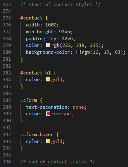
Contact CSS
Line 377 below deserves a quick mention. We chose min-height: 92vh; instead of min-height: 100vh; because we wanted the Footer to appear along with the Contact section in wider screen modes. On line 387, we gave the link to the Google Form the color of crimson. However, the hover effects on lines 392 through 394 will not be recognized for those who view this web page on a mobile device.
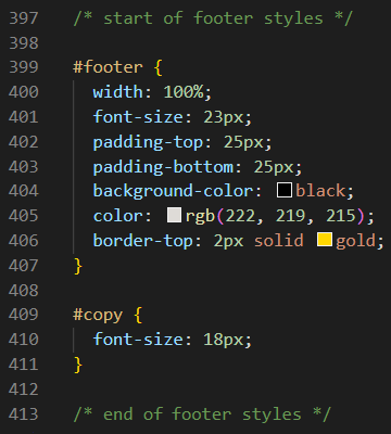
Footer CSS
These Footer CSS rules require no explanation.
Footer JavaScript
Now let's review the JavaScript code here that displays the copyright message in our Footer. The code on lines 66 through 71 adds an event listener that waits until all of the DOM Content is fully loaded before executing the rest of this code. On line 67, we call the getCopyrightYear function to obtain the current year for our copyright message. That function is on lines 44 through 48, and it returns the value of the current year to line 67, where it is assigned to the variable named thisYear. On line 68, we create the copyright message and assign it to a variable appropriately named copyright. And on line 69, we locate the exact area where this copyright message is supposed to appear, thanks to the unique id of copy, which exists on line 163 of our index.html file. All of the code used by the Carousel Slideshow was previously discussed.
Other CSS Code
We quickly jumped over the CSS code found at the beginning of the style.css file. So let's quickly look at it now. Lines 7 through 25 set some basic reset CSS guidelines, except for line 14, which enables the smooth-scrolling behavior that we like so much.
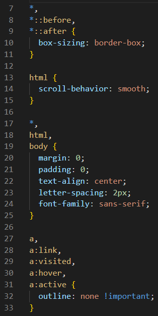
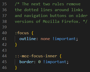
Lines 27 through 33 above, and lines 40 through 46 below, is a collection of old, obsolete code that was once required to fix behavioral issues with old Firefox web browsers. Once upon a time, Firefox had a bad habit of displaying borders and outlines around links. This code is probably no longer needed, but it is included here because it doesn't really impair this project's performance.
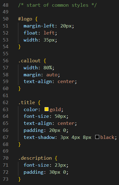
The CSS code shown below does have significance. Rules for the logo image on the NavBar are shown here, as are the rules for the callout, title, and description classes we previously discussed.
Media Queries
And that brings us to the media queries that exist at the very bottom of our style.css file. The code you see here only applies to screens that match the criteria listed below using max-width values. And the only effective way observe these media queries is to reduce the width of your browser screen accordingly.
The best and easiest way to test changes caused by reducing and increasing web browser screen widths is by using your Chrome Dev Tools. Hopefully you have already discovered these incredibly powerful tools and use them now on an almost daily basis. However, and if you have not, you should probably follow our Chrome Dev Tools tutorial that can be visited by clicking on this link here. Amazingly enough, that tutorial uses screenshots from this project to illustrate the ease-of-use and power that Dev Tools can provide to you. Of course this lesson will still be here when you return from our lessons on using Chrome Dev Tools.
Otherwise, you can continue viewing and testing these changes that happen, thanks to this series of eight different media queries. And the way we will test these media queries is by gradually reducing the width of the screen until we pass each one of these max-width thresholds.
And these eight max-width thresholds are defined as:
- 1300px
- 1200px
- 1100px
- 900px
- 825px
- 650px
- 500px
- 450px
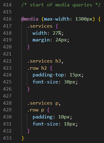
Let's begin by testing this first media query that becomes active when the width of the screen achieves a width of 1300px or less, but remains greater than the media query that follows this one, which becomes active when the width of the screen achieves a width of 1200px or less. And please click here to reopen this project, if it isn't open already.
If we use a Chrome Dev Tools preset of Laptop L - 1440px, then we can use the width control on the right side of the screen to reduce the screen width. But before we start reducing the screen width, we need to select the Services menu item to bring that web page section into view, because all of the changes we will see below are in that section. We can watch the numbers change on the top menu bar above the screen as we resize the screen. Notice how the width, margin, padding, and font-size of these elements change as we cross the max-width threshold. This is the method we will use to test all eight of these media queries. Now, let's move down to the next one.
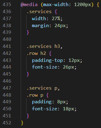
Although it's a rather subtle change, we can see these same elements change values even further as we cross the 1200px screen width threshold. However, the next media query will be quite a bit more dramatic. So let's test that one next.
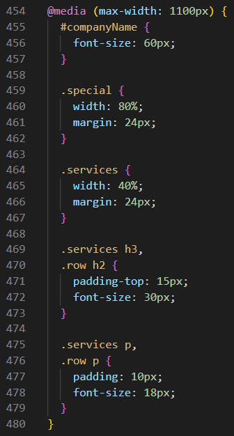
When we cross the 1100px screen width threshold, we can see some dramatic changes! In this Services section, we can see our two rows of three cards changing to three rows of two cards. And what makes that happen, you ask? Mostly it is the values of .services { width: 27%; } on line 437 above changing to .services { width: 40%; } on line 465 below.
But that's not the only dramatic change that happens when we cross the 1100px screen width threshold. If we scroll down to the Specials section below the Services section, we can see how those two rows of two cards are changing to four rows of one card per row. And this caused when the value of .special { width: 80%; } on line 460 changes from whatever it original value was before these media queries, and that was all the way up on line 322 where we assigned a value of .special { width: 45%; } so that we could fit two cards on each row.
But that's not all! If you scroll up to the Slideshow section, you will witness a major change in the #companyName font-size as well. These changes are all necessary to accommodate our progressively shrinking screen sizes.
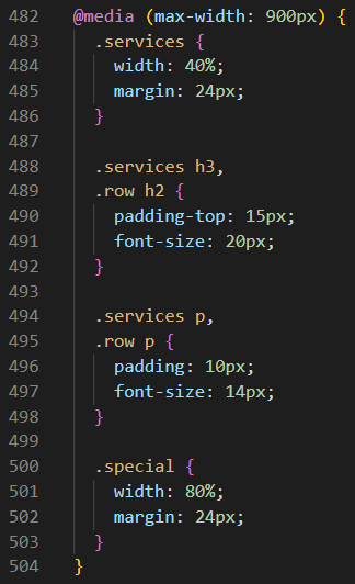
And once again, the changes in the values of the elements in the Services and Specials sections are noticeable but not dramatic when we cross the 900px screen width threshold.
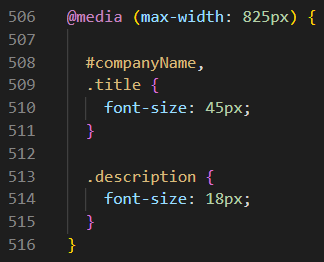
Let's see if you can figure out on you own where element values are changing when we cross the 825px screen width threshold. However, we will give you this hint. It is happening in many more places on our web page than in just one place.
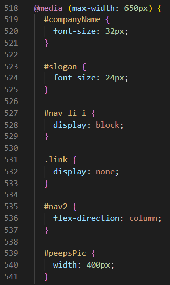
But once again, the changes are much more dramatic when we cross the 650px screen width threshold. In fact, there are so many changes, that we had to show them to you in two screenshots.
And we can look at the major changes that are happening on lines 519 through 541 below. Yes, the #companyName and #slogan have smaller font sizes in the Slideshow section. And the width of #peepsPic changes in the About section.
NavBar Switching
Now you should open yet another tab on your browser so that you can compare the original NavBar code with these changes that will happen in this media query as we cross the 650px screen width threshold. And we can do that by simply clicking on this link here.
The biggest changes we want you to recognize are happening above on lines 527 through 537. And whether you can easily recognize it by the name it is given on line 527 or not, #nav li i refers to the hamburger icon that was originally given the value of display: none; on line 113 of our style.css file. But it is now being assigned the value of display: block; on line 528, and that makes it appear on our NavBar. However, when the hamburger icon appears, that means that the horizontal menu items on the NavBar must disappear. And that is what is essentially happening on lines 531 through 533. Remember that each one of those items has two classes: grow and link. And those class names were assigned on line 31 through 35 of our index.html file. And if #nav is the name of our NavBar horizontal menu, and #nav2 is the name of our unordered list pulldown menu that extends from #nav, then we need to understand what is happening on lines 535 through 537.
Now this is where it gets tricky if you aren't paying close attention. Notice that the structure of our NavBar is based on two unordered lists <ul>. The first one has the unique id of nav and it stretches from line 20 through 37. However, the second one has the unique id of nav2 and it resides on lines 23 through 29. That means that it is also nested inside of nav, and is therefore a child of nav. Now let's look at the style.css code. On lines 87 though 93 we are defining the rules for #nav. And in particular, line 89 assigns display: flex; to #nav, which also must have another rule to arrange it as a horizontal menu, and that is happening thanks to line 90 with this flexbox rule of flex-direction: row;. But our pulldown menu named #nav2 is a child of #nav and it needs to have a value of flex-direction: column; so that it appears vertically as it replaces the horizontal menu that we had before. And that is why we need lines 535 through 537.
And we wish only that was the end of the complications. But the appearance and disppearance of these two different unordered lists is actually being controlled by the CSS rules on lines 160 through 162, which is a class named show that has the CSS rule of display: block;. But that class is only being added and removed through JavaScript, and we've looked at that JavaScript code before.
The Software Bug
But sadly, there is a tiny bug in this code, and we revealed it at the end of the Chrome Dev Tools tutorial that can be found by clicking here. And if you scroll down to the last two screenshots in that tutorial, you will see the situation we are talking about here. The situation we are describing is when two menus are displayed and fully functional simultaneously. So let's duplicate that situation for you right now to prove that it exists. And then we will give you the code required to fix this bug.
With the Exotic Island Vacations web page open while using Chrome Dev Tools, we can create this issue by setting the screen width to a value just less than 650px. At this point, the hamburger icon will appear, and if you click on that icon, the #nav2 dropdown menu will appear. Now, without clicking on any of the items in the pulldown menu, increase the width of screen until it reaches a width that is greater than 650px, so that the horizontal menu named nav appears. You now have two menus on your screen at the same time, which is not ideal.
The Software Bug Fix
There are two ways to fix this bug:
- You can manually type and insert the code shown below on lines 24 through 28 into your current script.js file.
- Or, you can delete that current script.js file from your project, and then download this script.js file to replace the one that has this bug in it.
Either way, when you repeat the steps above to reproduce this two menu situation again, the pulldown menu will disappear when the horizontal menu reappears.
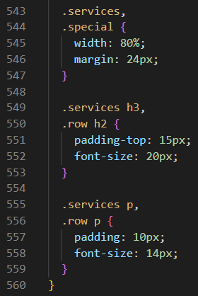
And that was everything you needed to know about the NavBar Switching part of this media query, that happens as you cross the 650px screen width threshold. But remember back when we told you that this media query would be presented to you in two parts? Well, this is that second part. And if you look at the code show below, you will see that most of this code deals with subtle changes in font-size and padding. However, line 545 changes the width of the cards in both the Specials and the Services section, so that both sections now only have one card per row. Actually this change happened to Specials with the 1100px media query on line 460. Here it is happening to Services on line 545 below, because width: 80%; only allows one card per row, not two.
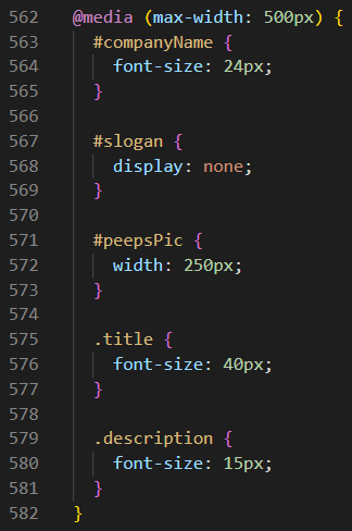
More subtle changes happen below with this 500px media query. But we wanted to mention That the #slogan that appears in the Slideshow disappears completely at this smaller screen width. And the code that makes that change happen is on lines 567 through 569 below.
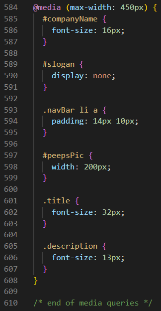
By the time our screen widths are reduced to 450px or less, the code you see below makes this web page look good on screens that are this size, and on screens that are even smaller. We even tested it on screens that were only 320px wide, and this web page still looked pretty good, even on those tiny screens.
In Summary
So what did we learn here? We learned that media queries are essential sometimes to make our web pages look good on all possible viewing devices. And the ability to work well on all devices is called mobile-responsiveness or mobile-friendliness. We also learned that we should be thinking about this from the very beginning, rather than trying to fix these issues as an afterthought. Making these changes on our own can require hours of our time. And for that reason alone, there is no better time to ask a good AI Chatbot to help you make these required changes.
In fact, even though we wrote all of this code ourselves, we discovered this software bug while we were testing our code and had no idea how to fix it on our own. The software bug fix here was written by ChatGPT. If you aren't recruiting help from Chrome Dev Tools and AI Chatbots while writing your code, then you are doing it the hard way. Learning to become a master at writing effective media queries is only part of the lesson here. Learning to use Chrome Dev Tools and AI Chatbots is just as important as well.