HTML Crash Course
HTML 101
Part 6. Using Dev Tools
View Page Source
Luckily for us, Chrome Dev Tools are already part of our web browser, so we can use them anytime we want simply by performing a right-click almost anywhere on the webpage. This will produce a menu something like the one shown below.
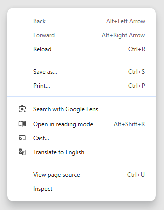
Near the bottom of this pulldown menu, you will find View page source. This is a handy way to see the source code for any webpage. When you do that, the browser will open the entire listing of the HTML code used to display the web page in a separate tab. But that's not all! You can also view any image file or any other linked file. Look for filenames that are displayed in blue text with underlines. If you click on them, then separate browser tabs will open with the contents of those files, like the style.css CSS stylesheet. Go ahead! Try it yourself on this web page, if you like. This is a great tool that allows you to see all of the code, images, and linked files used to create a web page. And for any image that you have opened in a separate tab, you can also right-click on that image, and then select Save image as... to download the image. And of course, you can copy-and-paste any or all of the text from these files for your own projects. Lots of early web developers learned how to write code simply by using these tricks of the trade to view the source code written by other programmers.
Of course there are many other options available to you on this pulldown menu, but we will leave it up to you to explore what each and every one of them does. But besides View page source, the ability to Inspect code is also very useful, and we will look at that next.
Inspect
The very last line in this pulldown menu is Inspect, which opens up Chrome Dev Tools, and that offers you lots of options. Like with Emmet, there are more bells and whistles here than we would like to explain. And you can use Inspect on web pages written by other people as well as your own web pages. These developer tools allow you to view the Console as a debugging tool when you are writing JavaScript code, so that is an invaluable tool. You can also use Dev Tools to test the mobile-responsiveness of your web pages, and that can save you hours of time rather than testing your code on dozens of different devices. We will dive deeper into this subject in a moment.
But just to be clear, why don't you right-click on this webpage, and then select Inspect from the pulldown menu. That action will open Chrome Dev Tools on the right side of the screen. Yes, there is lot here to see and learn about, but we wanted you to know how to open Chrome Dev Tools, even if we are going to skip a long tutorial at this point.
Mostly what we wanted to show you here is that these tools exist for your benefit. And Google has documented them better than we possibly could here, so please take the time to explore everything that Chrome Dev Tools can do for you. There are lots of other instructional videos and tutorial guides here as well. And who knows Chrome Dev Tools better than the people who invented them?
But we admit openly here that this can be a very deep rabbit hole to dive into right now. And we will show you other ways to troubleshoot your code if you find Chrome Dev Tools to be difficult and unwieldy. Eventually, when you get deeper into our CSS Coding Course, you will see how we sometimes use borders and HTML background-colors to indicate where our elements begin and end. For now, just realize that these Chrome Dev Tools exist as more handy items in your toolbox.
One last thing to mention here is that Chrome Dev Tools are available in a similar form on any Chromium-based web browser, not just Google Chrome. That includes Brave, Edge, and Opera. We should also mention that Mozilla Firefox and Apple's Safari web browsers also have development tools, but they work much differently than Chromium-based Dev Tools. We believe that the Chromium-based Dev Tools are superior to the others. And we've explained many times in the past why we believe that Google Chrome and Chromium-based web browsers are the best.
Testing Media Queries
We mentioned earlier that you can use Chrome Dev Tools to test the mobile-responsiveness of your web pages. In today's modern world, your web pages need to look just as good on your grandmother's old phone as on your techie uncle's huge 4K monitor, and on all possible screen sizes in-between. To accomplish this goal can be a monumental task, if you don't consider mobile-friendliness from the very start.
While writing media queries for a project named Exotic Island Adventures, we quickly realized that we needed to use our Chrome Dev Tools to help us achieve our goal of mobile-friendliness. If you want to follow along, you can click on the link above. Otherwise, you can just follow along with this tutorial while viewing our screenshots.
Don't forget that you can always click on screenshots on our web pages to get zoom-in screens in separate browser tabs.
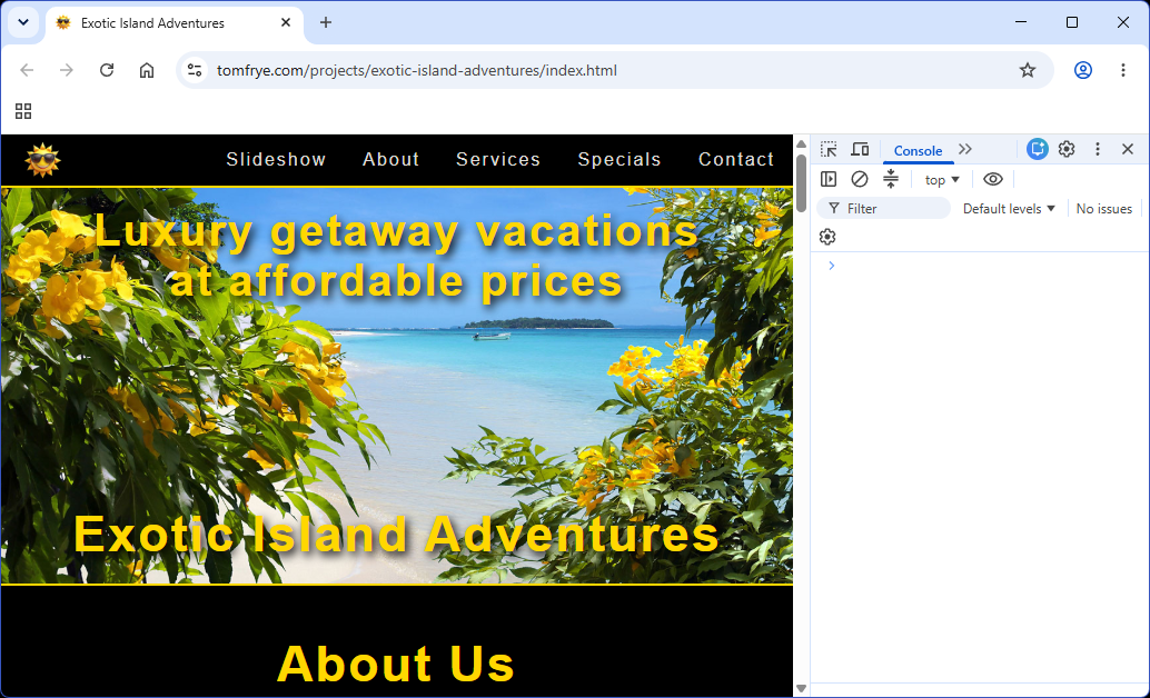
Of course, the first step to opening up Chrome Dev Tools is to right-click almost anywhere on the web page and then select Inspect from the bottom of the pulldown menu. We also selected the Console tab here to hide the somewhat distracting Elements screen. Performing these actions will produce a screen similar to the one shown below.
Perhaps our best possible tool for testing mobile-friendliness can be invoked by clicking on the icon being pointed to below.
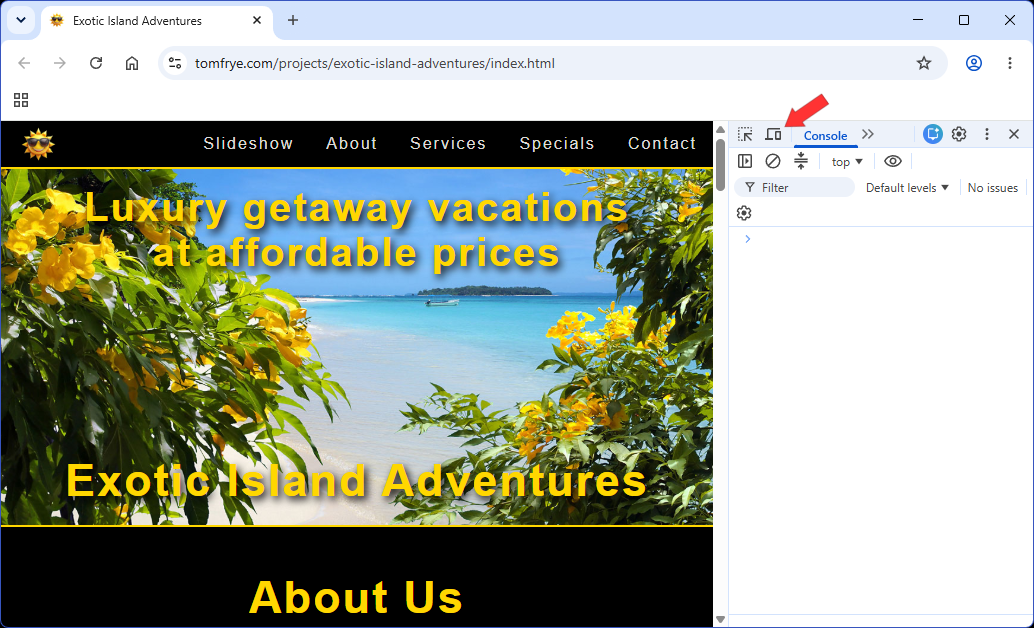
After you click on that icon, two horizontal menu bars appear above the web page, along with some controls along the margins of the web page. Let's look at these controls next.
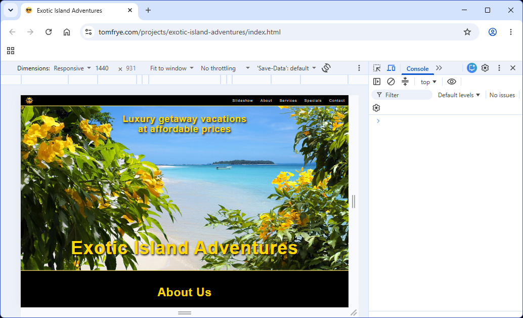
In this illustration below, we are pointing out three controls that allow you to expand or contract the web page's width, height, or both diagonally. Please feel free to click, hold, and drag those three controls to see how they change the web page's width and height. In fact, the current size of the web page is displayed on the top menu bar, and those numbers change as you move the controls. Right now, the dimensions it is reporting to us is 1440 × 931. Totally amazing, right?
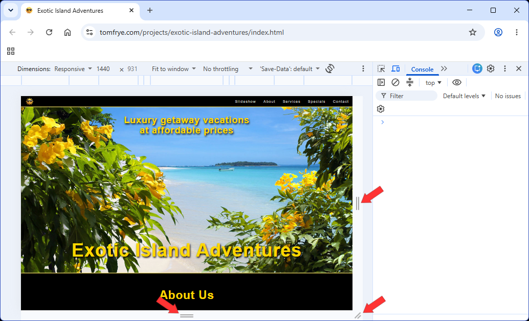
But those aren't the only controls we can use. On the second menu bar we see a bunch of gray and white blocks. These blocks are actual screen width presets. Notice that the ones on the ends are both white, but the rest are some shade of light gray. And, the text in the middle of that menu bar says Laptop L - 1440px. In the very next screenshot, we will see how it arrived at those numbers.
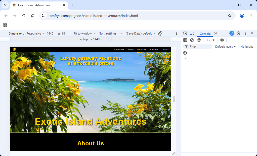
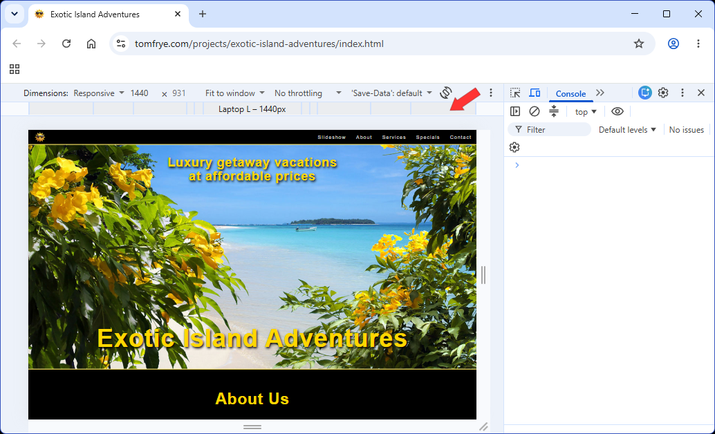
This preset was determined when the user clicked on the second menu bar at the location being pointed at. So it appears that the text is telling us that this represents the screen width of a large laptop. But feel free to click on other blocks to obtain different screen width presets.
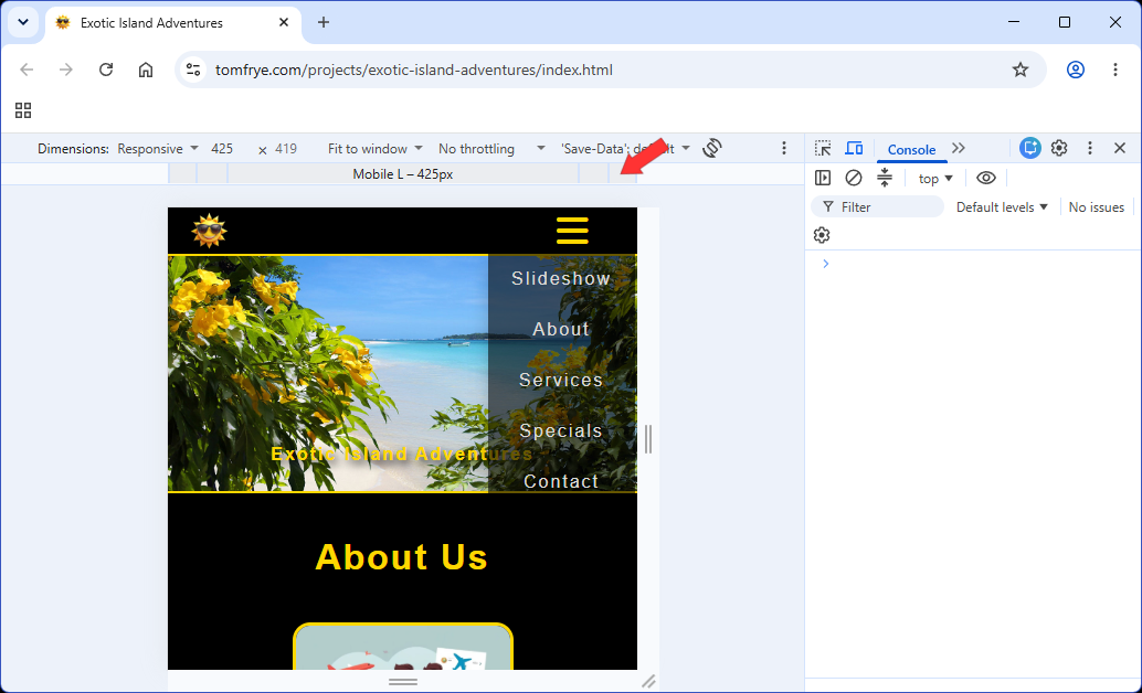
The screenshot we see below is telling us that this preset is Mobile L - 425px. And the dimensions reported on the menu bar above it seem to be reporting the same screen width. Perhaps it is telling us that this particular device preset is for a large mobile device. But look what just happened! The horizontal navigation menu on the right side of this web page just changed into a hamburger menu that invokes a pulldown menu when you click on the hamburger icon. Obviously this particular web page has some mobile-friendliness already built into it.
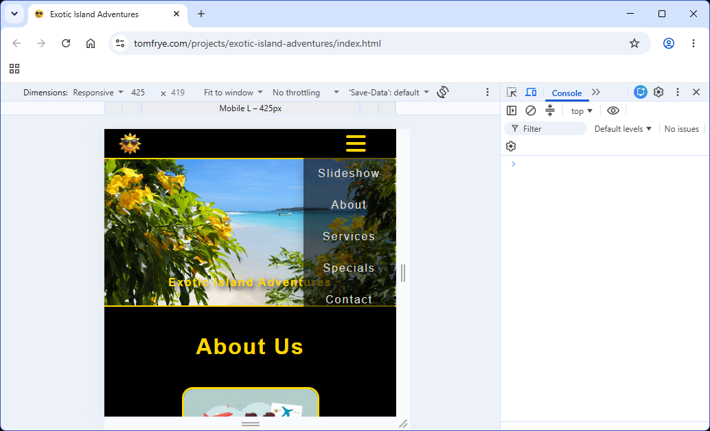
And the screenshot below shows us which block was clicked to produce this resulting preset.
But wait! That's not all that Chrome Dev Tools can do for us! If we click on the word Responsive to the right of the word Dimensions on the top menu bar, a pulldown menu appears with a list of popular and commonly-used mobile devices. Well, that seems rather helpful! Very few of us can afford to buy an armload of smart phones and tablet computers for use in testing our web pages, right? Look at the four categories: Mobile, Foldable, Tablets & Desktops, and Smart Displays.
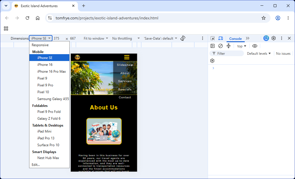
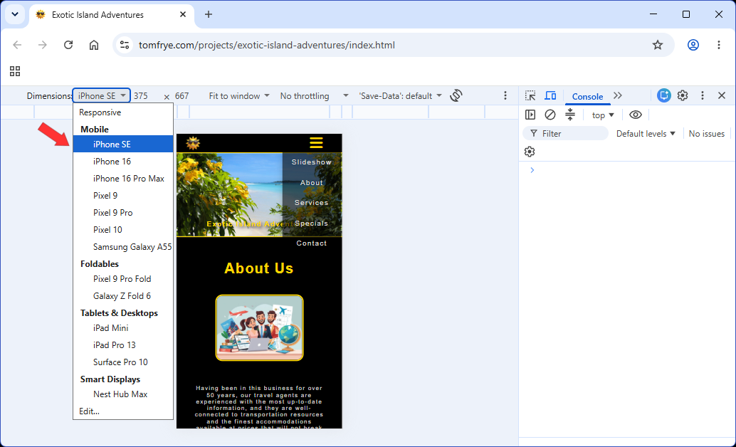
And this screenshot shows us how we got here: by clicking on the item named iPhone SE. And just in case you didn't already know, the resolution of an iPhone SE is 375 × 667. That seems helpful as well. Please feel free to click on the items on the actual web page's hamburger menu as well. This will give you a good idea of how well this web page performs on an actual iPhone SE mobile device. How helpful is that?
Well now let's see how our web page looks on a tablet computer, like an iPad Mini. And our Chrome Dev Tools is reporting the screen resolution of an iPad Mini as being 768 × 1024. Oh! And look! Our web page switched back to its original horizontal navigation menu. So that seems to be telling us that somewhere between a screen width of 425 pixels and a screen width of 768 pixels is where we switch to our hamburger menu. That's some nice-to-know info, agreed?
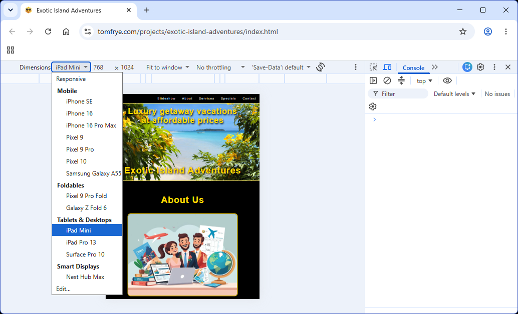
This screenshot shows us how we got here. It was just a click away.
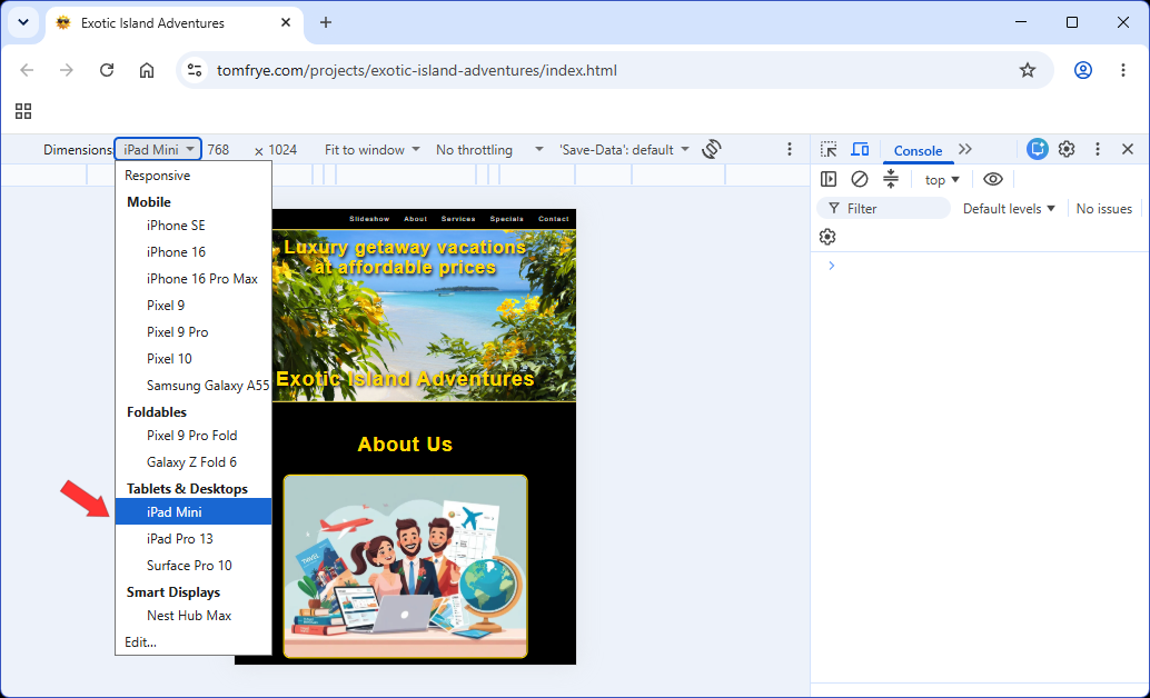
But just look at what happens with this particular web page when you have the hamburger dropdown menu showing, and then you select a wider screen size that reverts back to the horizontal navigation menu.
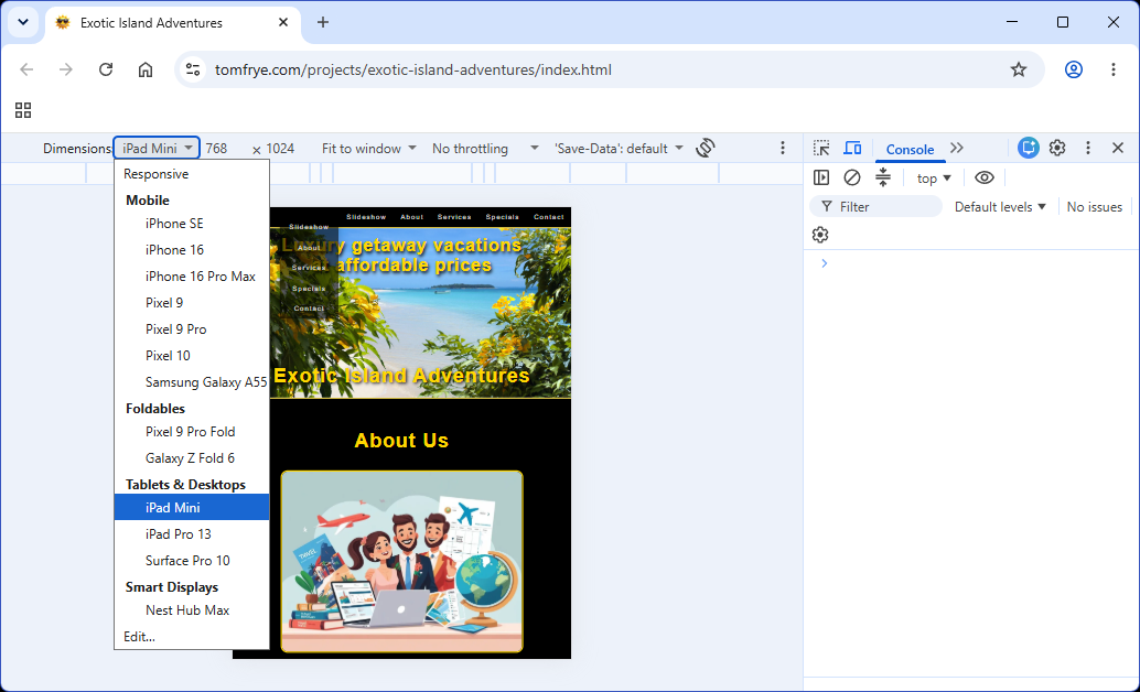
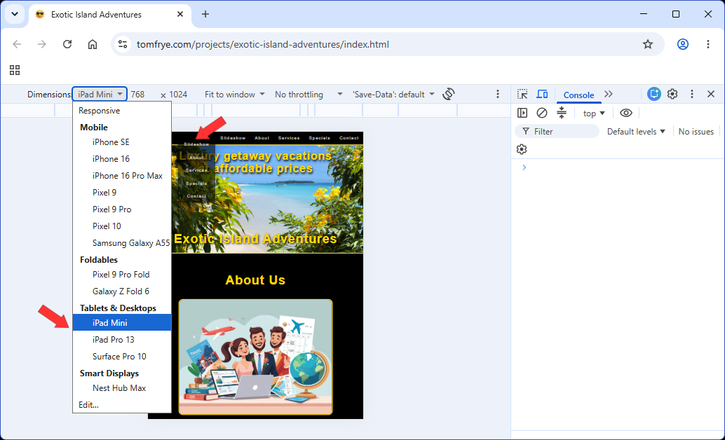
Now we have two menus to choose from. And both seem to be working, but we would probably consider that to be a bug. After all, when one menu appears, the other one should completely disappear. But this is the kind of hidden software bug that Chrome Dev Tools can help you find. And you didn't even have to drive to Best Buy to spend $25,000 on mobile test devices. No need to thank us. You're welcome!
We hope you found this tutorial helpful. This concludes our tutorial test drive of Chrome Dev Tools.